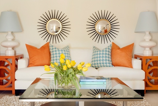
Usually with our great design posts we dig up some interesting tutorials for jazzing up your home. But, today we wanted to give you the foundation for good design so that you can make each room look fabulous with the things you already own that we adapted from feshome. There are a few basic design principles – especially for interior design that everyone agrees on. We are going to start with a very important one that I am sure all of you have heard of or even subconsciously used. Balance.
When a room a properly balanced, it compliments your furniture and the room. If you place a lamp on one end table but not the other, it can come off as unbalanced and unsettling. However, if you place a piece of art or a small stack of books on that end table you can create balance without having to have pairs of everything. This is the difference between symmetrical and asymmetrical balance. A stack of red books of varying shades on one end table matches up just fine with a reddish hued lamp on the opposing table, which gives balance in an asymmetrical fashion. This type of design is much more common and appropriate in modern design.
Symmetrical design is fairly simple of a concept, and no doubt at use at least once somewhere in your house, but let’s look at asymmetrical balance a bit more. When utilizing this design element, you are looking for things that aren’t necessarily the same, but have the same visual weight or eye attraction. If you have a tall skinny lamp on one side table, a small squatty stack of wide books won’t visually be as grabbing as the lamp and you won’t create balance. However, adding height to the books by placing a small vase on top, or a few taller baubles can attract the eye there. Also by changing up the color of the spines of the books and their shape you create something interesting for the eye to look at compared to the tall lamp. This is how you achieve asymmetrical balance well.
There is also radial balance, meaning that all balance is achieved radiating out from a center focal point. This can often be seen in rooms with a large chandelier, such as dining rooms or entryways, as well as rooms that have a circular architecture to them or central focal pieces, such as coffee tables. Radial balance is not often used in interior design but can be very interesting if done properly. If you have large bay windows you may be able to create some radial balance in your room. Some people would create a square space by clumping the furniture together, but you can get a lot more of an open feel by utilizing the space and focusing on the center of the room. In this way you would imagine all four “corners” of the room as sections requiring eye attention and design according to this.
Balance is extremely important in design and if you can attain it in each room it will create a more visually pleasing living space. We hope this explanation and tips help you understand more the principles of design so you can use them in your own home. Have fun playing designer and rearranging your rooms to play around with the idea!


No comments yet.